

This test is one of those classic conversion rate optimization moves that’ll make you wish you had a CRO expert on your team. (Good news! we’re available!)
While reviewing a client’s website, we noticed something that immediately stood out and needed to be fixed fast.
To explain it properly, let’s first look at the user journey:
Visitors would opt in to watch an on-demand webinar (about an hour long). After that, they’d be prompted to book a call and fill out a form.
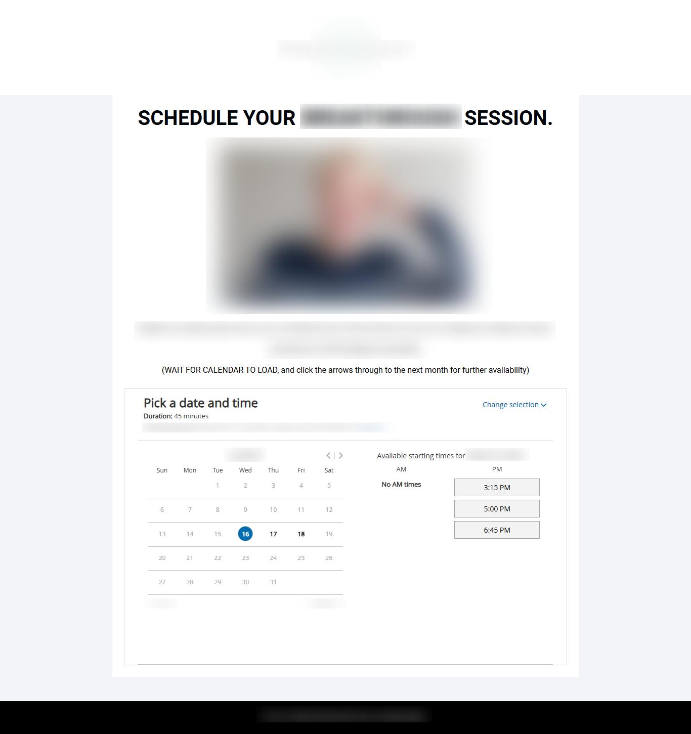
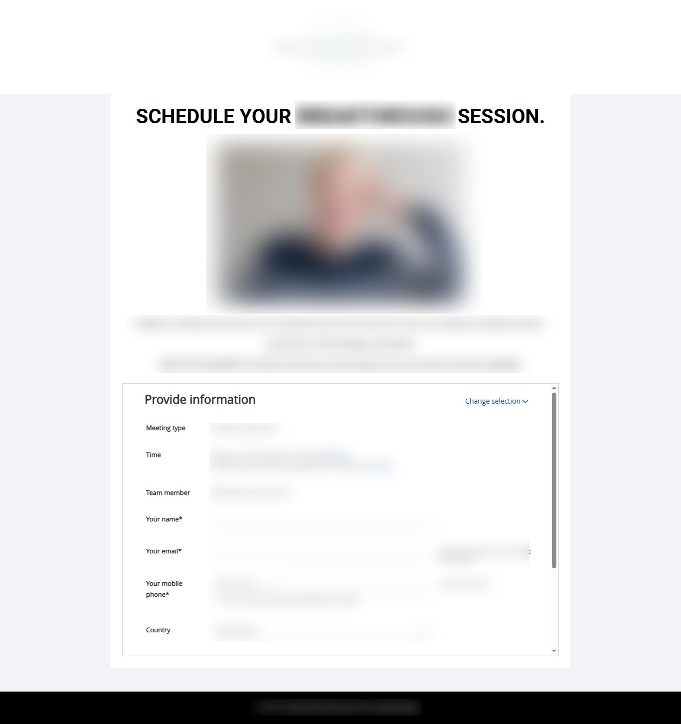
Once they selected their time and confirmed it, they were redirected to a mandatory application form that had to be filled out within two hours, or the scheduled call would be canceled.
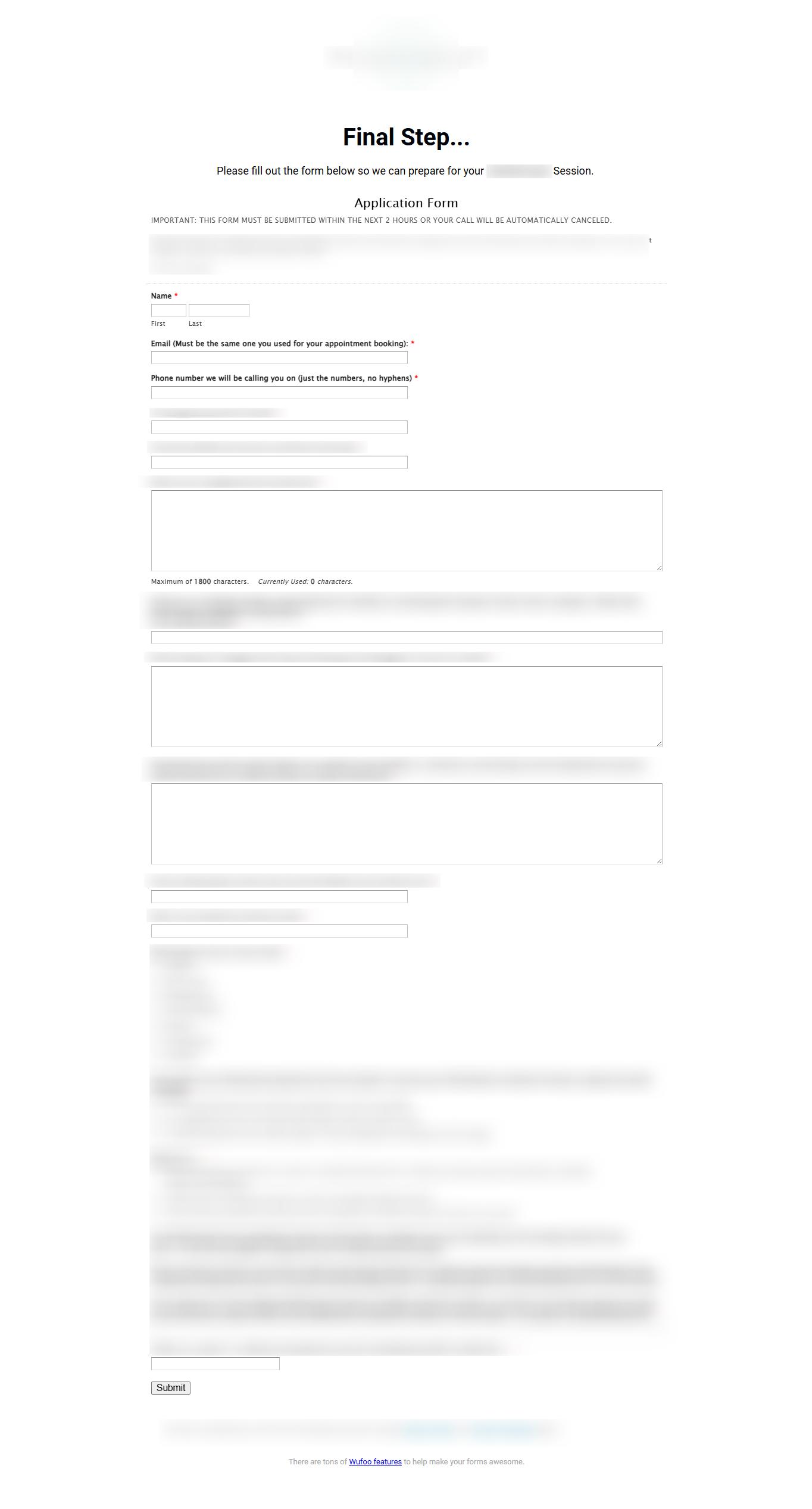
The problem? There was a lot of redundancy between the booking form and the application form. Personal info was asked twice, creating unnecessary steps and confusion. Clearly, merging these forms and removing redundant questions was a MUST.
Our Hypothesis
It seems obvious, right? Not only were we asking users to repeat themselves, but we also introduced a business rule that canceled calls if they didn’t finish the second form.
All of this complexity added friction and confusion.
Our thinking was simple: if you’re going to require the user to fill out an application, it has to be done in a single step along with the booking. That would create the smoothest possible experience.
We believed that combining the booking and application into one seamless step would improve the conversion rate, specifically, the rate of users fully submitting the application.
Test Design
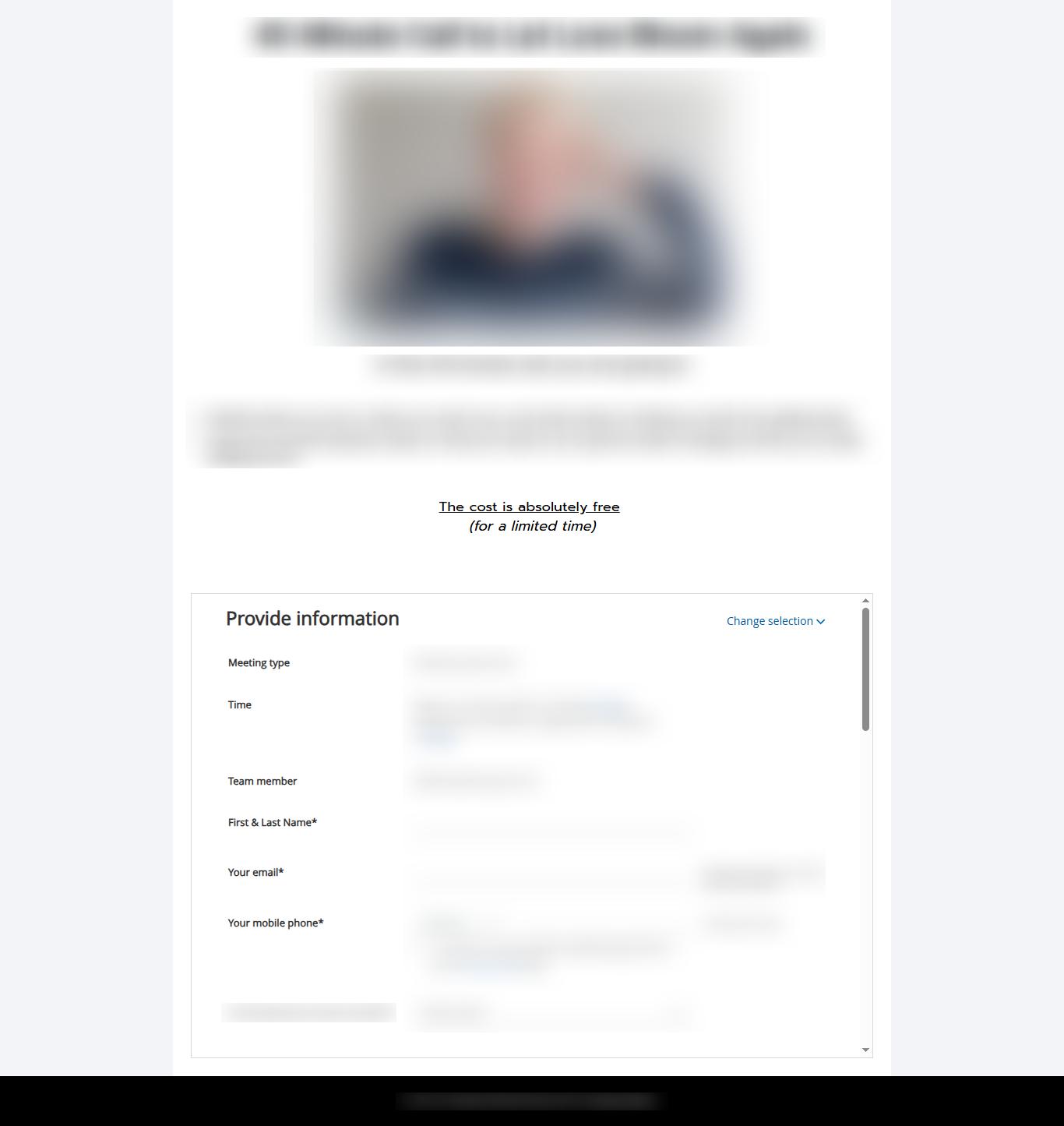
The client used OnceHub (ScheduleOnce) for booking and WuFoo for the application.
For the test group, we built the application questions directly into OnceHub. Users answered them right after confirming their time.
Result? The test group had one fewer step and a single, streamlined form instead of two separate ones.
Results
Over five days, 1,409 people went through the experiment. We saw a 26% improvement in the full form submission rate.
Breaking it down:
- In the control group, 14% of users completed the entire process.
- In the test group, 17.5% completed it.
- Interestingly, 21% of the control group chose a time but then abandoned the second step. That extra friction caused a big chunk of users to drop off before filling out the application.
So even though the old process got more people to start booking, a third of them dropped before the final step because of the clunky experience.
This was a huge win; and we even reached statistical significance faster than expected.

Conclusion
It might sound obvious to say “reduce unnecessary steps” and “keep it simple,” but it’s surprisingly easy to forget this when you’re busy making sure the tech setup works.
And when your audience might not be super tech-savvy, you have to leave as little room for confusion or friction as possible.
This experiment worked because we understood both the users and the technology. The client didn’t realize they could build a single-step form that did the work of both or hadn’t looked into it enough.
Having a team that understands both the user experience and the technical possibilities helps you make the most of every opportunity. (Yes, we’re available for hire!)

Final Thoughts
If you’re running a test on WordPress, Shopify, or ClickFunnels, you can access a step-by-step guide tailored to your platform. Just click to get started: [WordPress, Shopify, ClickFunnels].
But know that following the steps isn’t always enough.
When someone’s new to CRO, they often try so hard to follow every rule they’ve learned and that’s okay. That’s how you learn.
In this link, you’ll find some possible changes you can apply to your website forms to boost your conversion rate. But in our experience, it’s never enough to just know the rules. It’s about knowing where and when to use each of them.
The more experience you gain, the more you realize it’s not just about working hard or following best practices blindly. It’s about stepping back and really seeing things through the user’s eyes.
That’s the kind of team you want on your side.
If you’d like to work with a crew that thinks this way, just hit the ‘Contact Us’ button in the sidebar and tell us about your project.