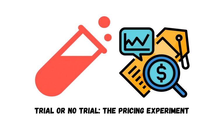

When it comes to optimizing conversion rates, the smallest details often carry the biggest weight. Application forms, for example, may look like a simple step in your funnel, but how you design them can completely change the quality of leads coming through.
Recently, we ran an experiment for one of our clients that challenged a common assumption: making a form “easier” always improves results.
Why This Test Mattered
The client’s funnel followed a familiar sequence:
- A webinar introduces the offer.
- Users are directed to an application form.
- The form determines whether the user qualifies to book a call with the sales team.
This form was crucial. it acted as a gatekeeper. Based on how applicants answered, the sales team decided whether to allocate precious call slots. The form originally contained descriptive, open-ended questions requiring written responses.
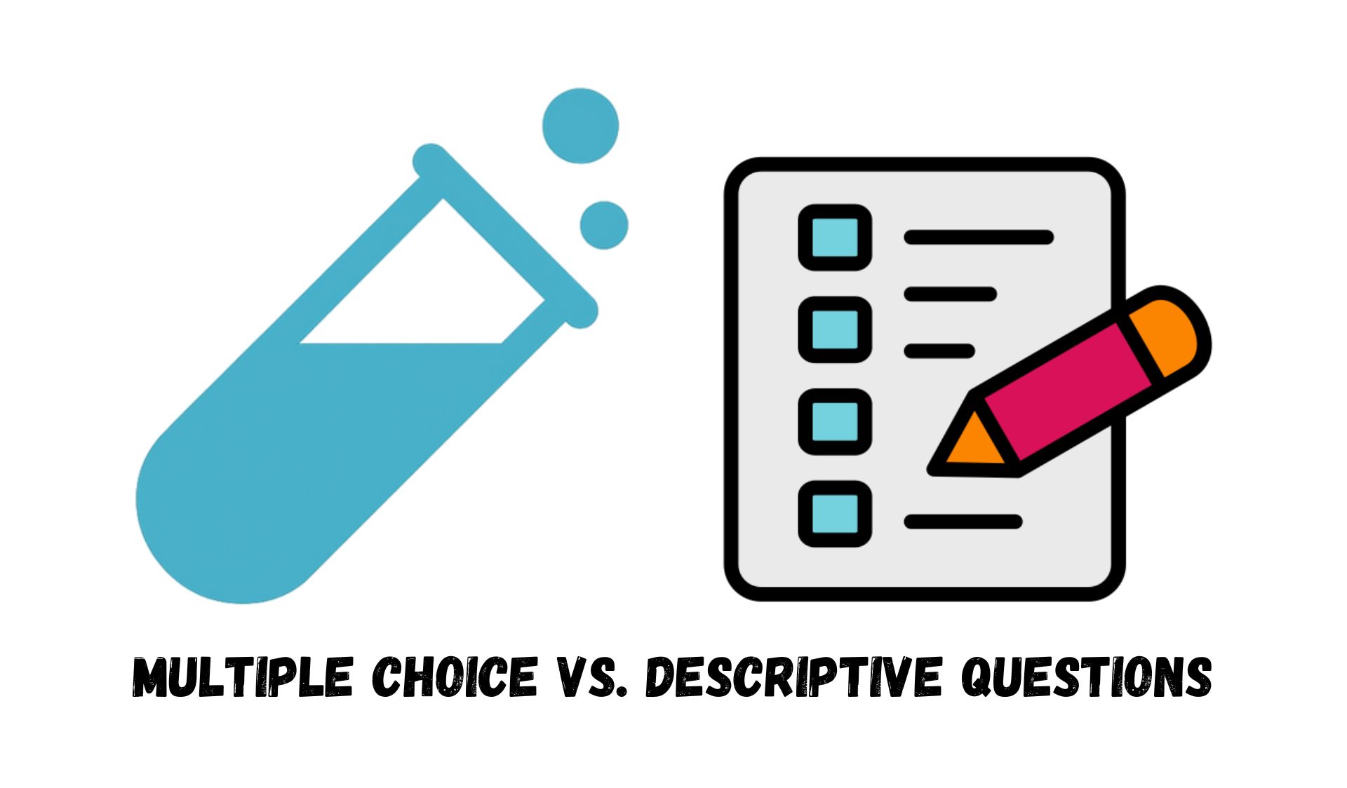
The client asked us to simplify the process by switching those questions to multiple-choice. The logic was clear: faster completion should mean more form submissions, and more submissions should mean more conversions. Right?
Hypothesis
Our hypothesis was straightforward:
- If we replaced open-ended questions with multiple choice,
- Then more users would finish the form,
- Because it would require less effort and time to complete.
The underlying concern, however, was quality. Would lowering the “friction” of the form bring in more people who weren’t actually serious about the offer?
Test Design
To ensure fairness, we created two versions of the application form:
- Control: The original form with open-ended, descriptive questions.
- Variation: The same form, but with questions rewritten in multiple-choice format.
Since not all questions could directly translate into multiple choice, the client helped restructure them so they still captured meaningful answers while being simpler to fill out.
Results
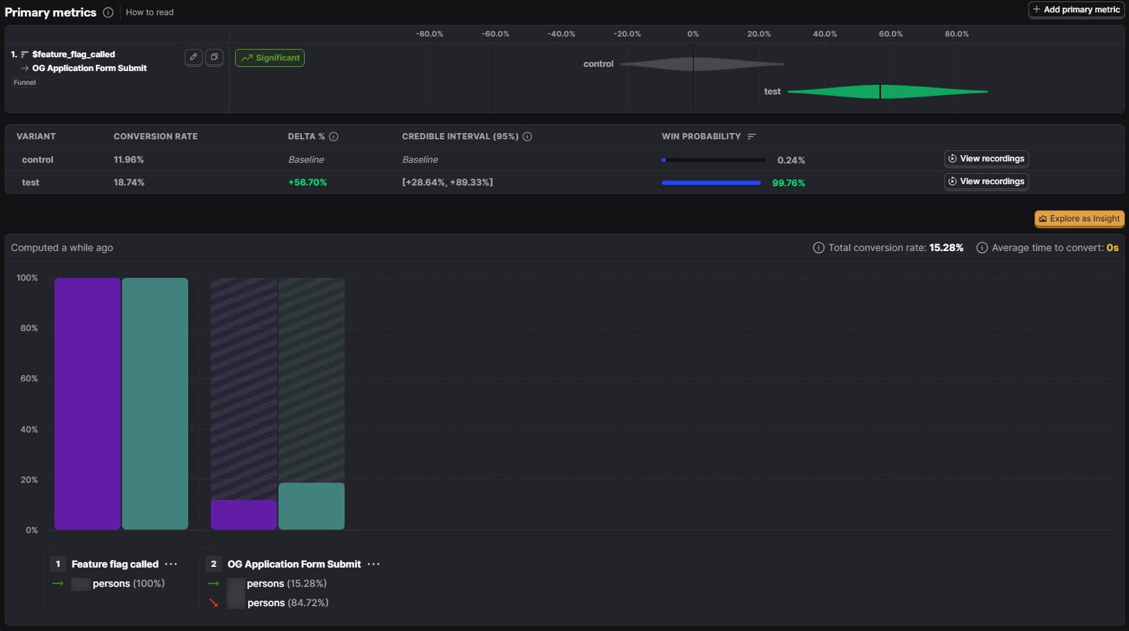
We split traffic evenly between the two versions and let the test run for 10 days.
On the surface, the results looked like a huge win:
- Form submissions increased by +56.7% in the test group.
At first glance, this was a conversion optimizer’s dream. Twice as many people were making it through the application.
But numbers don’t always tell the full story.
Within days, the sales team began flagging issues. Leads from the multiple-choice form weren’t showing up for booked calls. Many who did show up weren’t qualified at all.
When we zoomed out to look at the ultimate conversion metric (purchases) the story flipped:
- Application-to-purchase conversion rates dropped in the test group.
- Sales resources were wasted chasing low-quality leads.
- No-shows spiked, leaving valuable call slots empty.
The apparent success of higher form submissions had actually damaged overall performance.
Key Takeaways
This experiment delivered one of the most important lessons in CRO: friction isn’t always the enemy.
Here’s what we learned:
- Conversion rate ≠ success. A 57% increase in form completions meant nothing if it didn’t translate into meaningful revenue.
- Sales team alignment is critical. Optimizations must consider the downstream impact on sales and operations; not just top-of-funnel metrics.
- Ad platforms learn from your signals. For a few weeks after the test, Meta and Google Ads picked up on the wrong audience profile, further lowering traffic quality. Sending poor signals to your ad platforms can have lasting effects.
Friction isn’t always bad. Sometimes it’s the guardrail that protects your funnel, your resources, and your ad performance.
There are, of course, smarter ways to manage this balance. For example, you can prevent certain events from firing based on form answers, or go more advanced by predicting a lead’s probability of enrolling and sending that value to your ad platforms. We later implemented exactly this for the same client; more on that soon.

Conclusion
This A/B test may have started with a promising +57% lift in form submissions, but it ended with a crucial realization: more isn’t always better. The real goal isn’t simply to increase conversions at any cost. it’s to increase the right conversions.
Sometimes, the obstacles in your funnel are there for a reason. They may be keeping out those who won’t buy, don’t qualify, or will waste your team’s time. And in that sense, friction becomes not a problem, but a feature.
If you’re investing in paid ads and running application-based funnels, think carefully about the trade-off between speed and quality. And if you want a partner who’s been through these battles before and knows how to avoid them, you know where to find us 😉
If you want to run a test on WordPress, Shopify, or ClickFunnels and need some help for that, Get started with our platform-specific step-by-step guides: [WordPress, Shopify, ClickFunnels].
To make things easier, you can use this link, which provides a collection of application form templates ready to be implemented on your website.