
In conversion rate optimization (CRO), we often hear the mantra “simpler is better.” Streamline the form. Remove friction. Cut the clutter. But what happens when simplicity doesn’t deliver the results you expect?
This is the story of one of our A/B tests where we challenged that rule and learned an unexpected lesson about the power of a single question.
Setting the Stage: The Application Funnel
One of our clients runs a high-ticket program. Their funnel is straightforward:
- Webinar: Visitors watch an in-depth session explaining the program.
- Application Form: Interested viewers fill out a form to request a call.
- Booking a Session: Qualified leads book a call with the team.
It’s that application form (the bridge between interest and action) where we focused our experiment. The form contained several questions, including one about urgency: “How urgent are you feeling about getting the tools and support to step into your ‘…’ and build a thriving ‘us against the world’ ‘…’?”
At first glance, it seemed unnecessary. Did we really need to ask this? Was it adding value, or just making the form longer than it needed to be?
The Hypothesis: Would Removing a Question Improve Conversions?
Here’s what we believed:
- Shorter forms convert better. Every CRO expert has said it. It’s backed by plenty of studies.
- Urgency questions might add pressure. Could this question make some users uncomfortable?
So, we hypothesized: Removing the urgency question will increase form submissions.
Our reasoning was simple:
- Fewer fields = lower friction.
- Less perceived pressure = higher comfort = higher conversion.
If we could achieve even a modest increase in applications, we’d fill the pipeline with more leads and hopefully more paying clients.
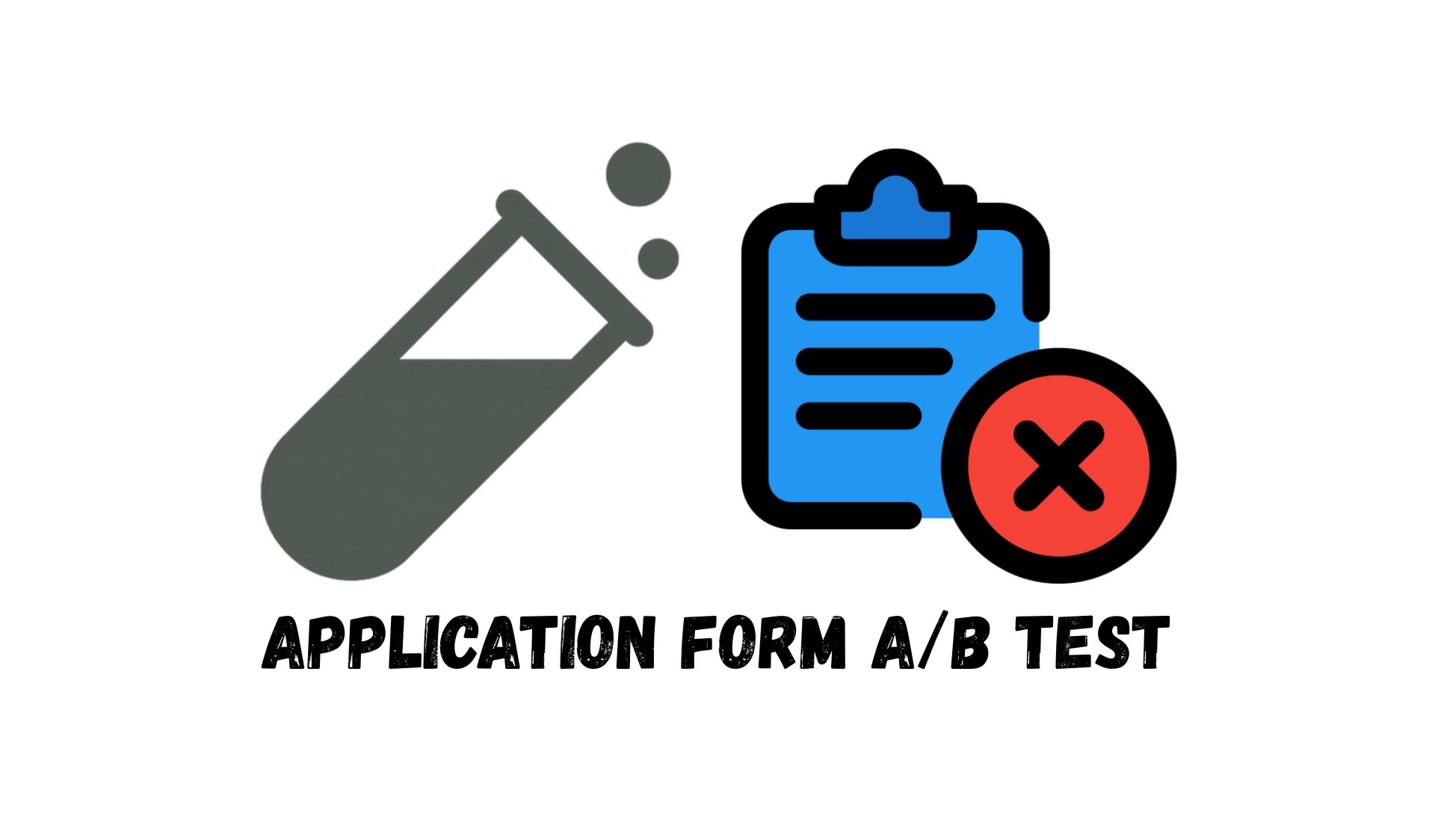
Test Design
We ran a classic A/B test:
- Control: The original application form (with the urgency question).
- Variant: The same form, minus that one question.
Test size: 4,210 participants
Duration: 5 days
Primary metric: Form submission rate
Secondary metrics: Show-up rates, call cancellations, and demographic quality indicators (like household income).
The Results: A Win That Wasn’t
On the surface, the results were promising. Form submissions increased by 4%. Success, right?
But when we dug deeper, the story changed.
High-income applicants decreased. Fewer people from top income brackets submitted the form in the test group.
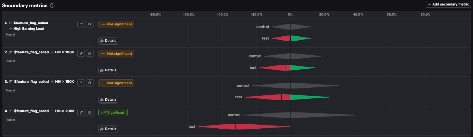
Show-up rates dropped by 4%. Even among those who booked calls, fewer actually attended.
Cancellations increased. Both client-initiated and user-initiated cancellations rose in the variant group.

The people filling out the form weren’t the people we wanted. In other words: We got more leads but they were less qualified.
This was the big question: Why would removing one simple field cause such a shift in lead quality?
Our theory:
- The urgency question acted as a qualifier. It may have encouraged only the most committed leads to move forward.
- It created a subtle sense of commitment. When users reflected on how soon they wanted a solution, it made the process feel more serious.
- High-value leads are more willing to answer tough questions. Those in higher income brackets may not mind the extra step if they’re truly interested.
It turns out that this “friction” wasn’t friction at all; it was a filter.
What This Test Taught Us
This experiment reminded us that conversion rate alone isn’t enough. It’s tempting to celebrate higher numbers, but quantity without quality doesn’t grow a business.
Here are our biggest takeaways:
- Measure more than one metric. Always define secondary metrics (lead quality, show-up rates, revenue impact). A higher submission rate is meaningless if revenue doesn’t increase.
- Not all friction is bad. Some questions qualify leads and encourage commitment. Removing them can backfire.
- Dig deeper before declaring a winner. At first glance, the test seemed like a success. But analyzing downstream behaviors told a different story.

Conclusion
This A/B test was humbling. We thought removing a single “unnecessary” question would boost results. Instead, it compromised lead quality and reduced show-up rates.
In CRO, more isn’t always better. But sometimes the question you think is slowing people down is actually helping you find the right people.
So, next time you’re tempted to simplify your forms, ask yourself: What am I really optimizing for: quantity or quality?
Need help running a test on WordPress, Shopify, or ClickFunnels? Get started with our platform-specific step-by-step guides: [WordPress, Shopify, ClickFunnels].