
Conversion Rate Optimization (CRO) is never a finished job. Every funnel you build, no matter how optimized it seems, has room for improvement. One of our recent experiments with a client reminded us of this simple truth; and the results were eye-opening.
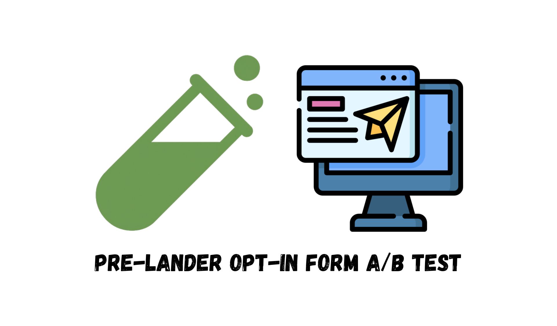
In this case study, we’ll walk through a Pre-lander opt-in form A/B test we ran for a client in the relationship coaching space. We’ll cover the strategy behind it, the hypothesis we tested, and the results that prove just how powerful the “right words” can be when guiding users through a funnel.
Why Use a Pre-lander at All?
If you’ve ever run paid ads that direct traffic straight to a webinar or sales page, you know how fragile that first impression can be. A user lands cold, skims for a few seconds, and often bounces before engaging further.
That’s where a pre-landing page comes in. Think of it as a warm handshake before the main conversation. It’s a lightweight page placed between the ad and the main landing page. The goal isn’t to sell but to:
- Warm up interest by making the user feel understood.
- Create participation through micro-commitments, like answering a question.
- Build alignment between the problem the user feels and the solution you’re about to offer.
In our client’s funnel, users first saw the pre-lander, then watched a webinar, and finally completed an application form to book a consultation call. The pre-lander was designed to improve the chances of users staying engaged all the way through to the application.
Hypothesis
Our client originally suggested a form for the pre-lander that included three long, descriptive questions written in a very serious tone. The focus was entirely on the problem. It was thoughtful, but heavy; like being handed a detailed questionnaire at the doctor’s office before you’ve even sat down.
Our hunch? This form would create friction.
So we proposed a different version. Instead of long statements, we wrote short, conversational, emotionally reflective questions. To be honest, the probable answers were obvious. They could easily read and pick their answers without thinking about it much; And that was our idea! To make the user feel like they were having a quick, natural conversation rather than filling out a survey. By lowering the cognitive load and focusing on relatable emotions, we aimed to make it easier (and more appealing) for people to submit the form. A secondary goal of this simple questionnaire was to remind them of the problems they had. Sometimes people get used to their longstanding problems and they need a simple nudge in form of a question to remind them how different their world could be. And that’s what we did in this experiment.
Test Design
We set up a classic A/B test with two groups of users:
- Control group saw the client’s original form which has a serious tone, long descriptive statements and it’s problem-focused..
- Test group saw our redesigned conversational form which has a conversational tone, short answers and it’s emotionally reflective with low pressure.
Both forms were embedded on the pre-landing page and acted as the opt-in step before the webinar. The key metrics we tracked were:
- Primary metric: Application form submission rate (the form after the webinar).
- Secondary metric: Opt-in form completion rate (on the pre-lander itself).
Results: A Clear Winner
The test ran for 11 days, and the outcome couldn’t have been more clear:
Application form submissions: The conversational form drove a 99.07% win probability compared to the control.
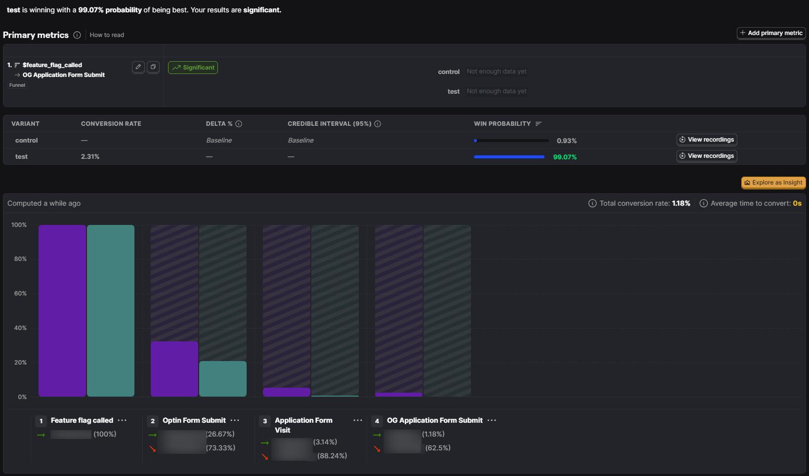
Opt-in form completions: The test version improved submissions by +51.77% compared to the client’s version.
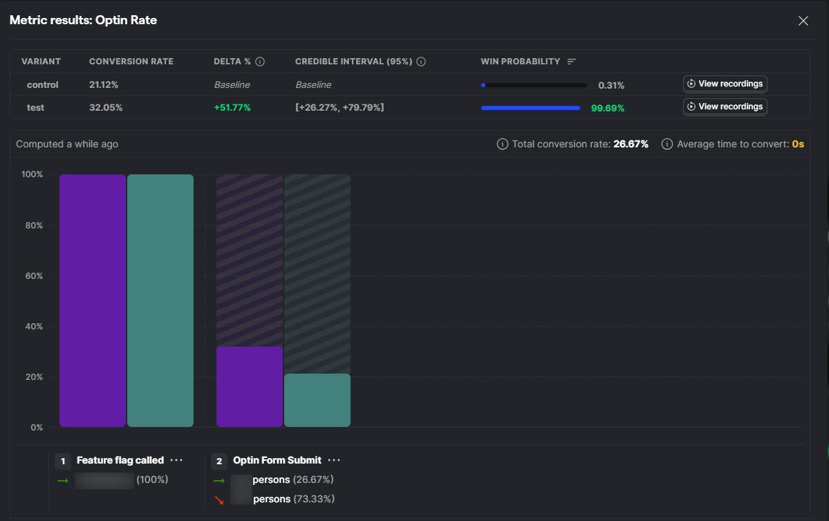
Why does this matter? Because the application form came after the webinar. Seeing such a large lift in applications meant that the lighter, conversational pre-lander not only improved form submissions upfront but also had a compounding effect across the entire funnel. Users were more engaged, more attentive during the webinar, and more likely to take the final step.
Lessons Learned
This experiment reinforced some valuable principles for anyone designing pre-landers:
- Keep it light. The pre-lander isn’t the place for heavy lifting. Use short, simple questions that are easy to answer.
- Make it personal. Frame questions in a way that feels conversational and emotionally relatable. You want users to think, “That’s exactly how I feel.”
- Align with the offer. Every question should naturally connect to the promise of your webinar or product, so the user feels the journey is made for them. Or at least remind them that you’re providing a solution for the exact problem they have.
- Test tonality, not just structure. Even if the questions are on-topic, the tone can make or break performance. The difference between “clinical” and “human” wording was everything in this case.
- Remember the compounding effect. Small optimizations at the top of the funnel ripple down. A better pre-lander leads to better engagement, which leads to better conversions at the final stage.

Conclusion
The Pre-lander opt-in form A/B test proved something we often tell clients: the words you choose matter as much as the structure of your funnel. Had we stopped at simply adding a pre-lander with the client’s original form, we might have celebrated a small win. But by questioning the tone and reframing the questions in a conversational way, we uncovered a much bigger opportunity.
For CRO professionals and growth teams, the takeaway is simple: never stop at “good enough.” Each step of the funnel (from the pre-lander to the final call-to-action) deserves its own set of experiments. The smallest tweaks in tone or phrasing can have the biggest impact on results.
If you’re looking to unlock more conversions in your own funnels, start with your pre-lander. Ask yourself: is this page making users feel pressured, or is it inviting them into a conversation?
That difference could be worth more than you think.
You may find it helpful to check out this website; it explains the entire process of running an A/B test for a landing page from start to finish.
And if you want to run a test on WordPress, Shopify, or ClickFunnels and need some help for that, Get started with our platform-specific step-by-step guides: [WordPress, Shopify, ClickFunnels].