
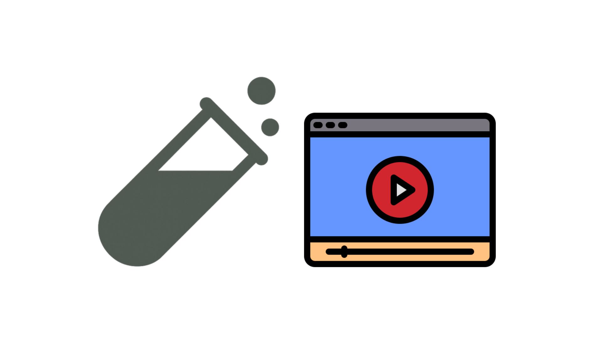
This is another test focused on the videos used in our client’s sales page.
This time, we’re trying to understand how our audience reacts to videos of different lengths. In fact, this experiment gives us valuable insights into user behavior and helps us optimize content structure based on those learnings.
Hypothesis
To learn more about our audience, we decided to test different versions of the same video; each with a different length. Our hypothesis was that the test results would provide meaningful insights for future content strategy.
Countdown Timer Note
On this particular sales page, a countdown timer starts as soon as the user opens the page. In the original setup, the timer was set to 5:40, which matched a strategic moment in the 10-minute video. At that point, the rest of the sales page would load if the viewer was still engaged.
However, for the purpose of this experiment, we needed to standardize the experience. Since we couldn’t set separate timers for each test group, we shortened the timer to 2:28 for both the control and test group. This change ensured fairness across versions, though it deviated from the original design.
Test Design
We tested two versions of the video sales letter (VSL):
- Control: A 10-minute video with heavier edits and background music.
- Test: A 6-minute version with lighter editing.
Both versions delivered the same core message: encouraging viewers to take control of their personal finances by joining the community. Importantly, they both moved away from the previous angle of “increased support for travel hacking.” It’s also worth noting that the shorter version communicates this new angle more directly, while the longer version includes more editing and a deeper explanation of the message.
Results
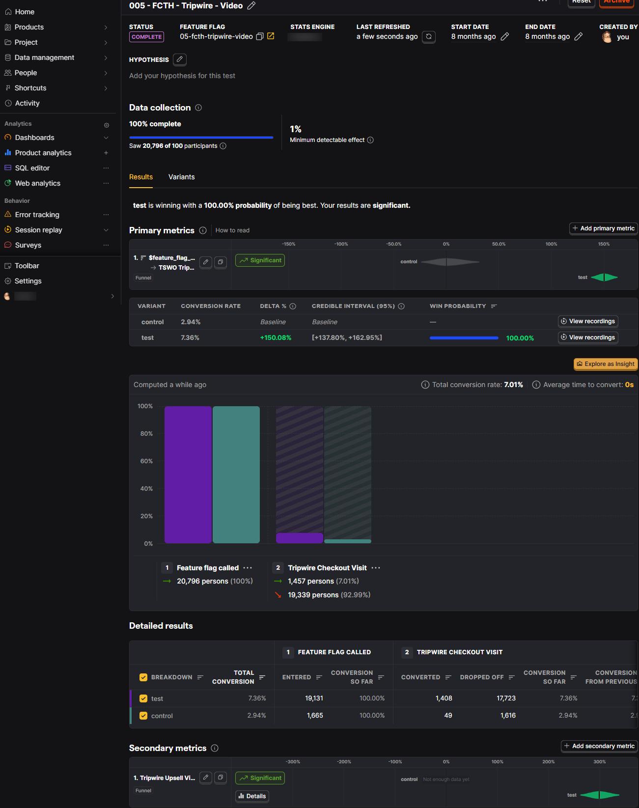
The experiment ran from Friday, Oct 18, 2024, at 6:48 PM UTC, and ended 24 hours later. During this time, 20,796 users participated.
The test version (6-minute video) performed significantly better, with a 100% probability of being the best variant.

Conclusion
While both videos followed the same structure and messaging angle, the shorter 6-minute version, which focused more clearly on personal finance control, outperformed the longer version.
This aligns with our previous findings: simplicity, clarity, and a focused message drive better results.
Heavy editing and longer run-time don’t necessarily improve conversion and in this case, they may have diluted the core message.
Simplicity wins. A focused message, delivered clearly and efficiently, can outperform a highly produced version, especially when the audience is early in the funnel.
Read this PostHog article to better understand how to set up A/B/n testing.
Also, check out these articles to learn how to set up A/B test on the following platforms. [WordPress, ClickFunnels]