
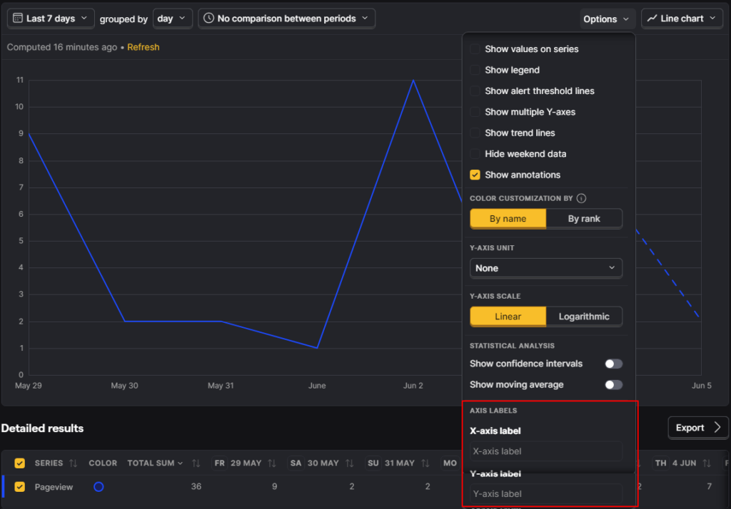
PostHog trends line and bar charts now support custom X-axis and Y-axis labels.
That may sound minor, but anyone who presents analytics regularly knows it is not minor. A chart can be technically correct and still communicate badly if the axes are too vague, too tool-native, or too awkward for the stakeholder reading it.
Custom axis labels reduce that friction.
What Changed?
- trends line charts support custom X-axis and Y-axis labels
- trends bar charts support custom X-axis and Y-axis labels
- labels are configured in the chart’s
Options - long labels are automatically truncated so they do not clip the chart
Why This Matters
Reporting clarity matters because most dashboards are consumed by people who did not build them.
Default chart labels often reflect internal tool wording rather than the clearest business wording. Custom labels help teams:
- rename axes for stakeholder clarity
- make presentation screenshots easier to understand
- align charts with metric definitions used elsewhere
- avoid tool jargon when communicating with nontechnical audiences
Good Use Cases
Useful examples include:
- replacing a generic count axis with
Qualified signups - renaming a time axis to match the reporting period language used in a client deck
- clarifying whether a trend is users, events, revenue, or rate
The best labels reduce ambiguity, not just add more words.
How to Use It Well
Open the trend chart options and edit both axes where useful.
The quality rule is simple:
- make the label more specific than the default
- keep it short enough to stay readable
- match the business definition of the metric
PostHog already truncates long labels to avoid clipping, but that should not be an excuse to write bloated labels.
Common Mistakes to Avoid
- Using labels that sound nicer but are less precise.
- Renaming a metric in the chart without aligning the label to the real metric definition.
- Creating stakeholder-facing labels that hide caveats you still need to communicate elsewhere.
- Overwriting a useful default with something vague like
Performance.
Business Context
This update improves chart usability, not measurement quality. But that still matters.
Better labeling helps stakeholders interpret charts faster and reduces the odds that a team argues over wording instead of discussing what the data actually means.
For agencies and growth teams, that is valuable because analytics communication quality affects decision quality.
Frequently asked questions
Where do I set the labels?
In the chart's Options.
Does PostHog support both axes?
Yes. The release note says both X-axis and Y-axis labels are supported.
Why is this useful?
It improves chart readability and helps teams use business-language labels instead of tool-native defaults.
What happens if the label is too long?
PostHog says long labels are automatically truncated so they do not clip the chart.
Does this change the data itself?
No. It changes presentation clarity, not the underlying metric logic.
Who benefits most from this feature?
Teams that share dashboards with clients, leadership, or nontechnical stakeholders.
Should I rename every chart axis?
No. Only change labels when it makes the chart clearer.
Can bad labels still create confusion?
Yes. A custom label can be worse than the default if it is vague or imprecise.
Is this a reporting feature or an analytics feature?
It is primarily a reporting clarity feature inside analytics.