
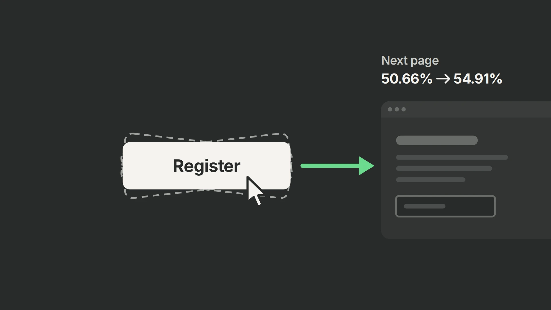
In a seven-day test with 1,974 participants, removing the CTA’s repeated wobble raised next-page progression from 50.66% to 54.91%, with a 97.09% historical win probability. Button copy, position and destination stayed fixed. The result favored removing decorative motion in this funnel; because the outcome was a page-view proxy, pair your own test with verified registrations or the later business outcome.
Why we tested the quieter button
We had already run 30+ experiments on this funnel and had seen salesy or highly polished treatments struggle with this audience. That experience led us to question the familiar ClickFunnels wobble: perhaps removing it would make the next step less distracting.
| Element | Control | Treatment |
|---|---|---|
| Button design and placement | Existing design and position | Same design and position |
| Motion | Wobble animation enabled | Wobble animation removed |
| Measured outcome | Reaching the next page | Reaching the same next page |
Our script targeted the button by CSS selector and replaced its animation class for treatment. We kept the label, destination, position, appearance and click behavior fixed. For the current selector and assignment setup, use our ClickFunnels experiment script; this treatment changes motion rather than swapping the offer.
Results: 42 more next-page conversions
We ran the test for seven days with 1,974 participants, split into 987 per arm. The primary metric was a page view on the next page, used as the opt-in proxy.
| Measure | Animated control | No-animation treatment |
|---|---|---|
| Participants | 987 | 987 |
| Next-page conversions | 500 | 542 |
| Rate | 50.66% | 54.91% |
| Historical win probability | 2.91% | 97.09% |
Progression rose by 4.26 percentage points, an 8.40% relative increase. The historical 95% relative-lift interval was approximately +2.24% to +14.48%.
The historical 97.09% win probability and relative-lift interval favored removing motion on next-page progression. We would keep the quieter button in this funnel and verify the later business outcome.
A next-page view establishes progression, rather than a verified backend registration or purchase, so a new test should pair it with the successful submission and later business outcome.
Why might removing motion help?
Less distraction or a preference for a calmer button could explain the result. We did not ask visitors about trust or measure attention, so “trust beats tactics” would go further than the experiment.
Change the motion and preserve the interaction
First identify the exact CSS class or animation declaration responsible for the wobble. Remove only that motion in the treatment, retaining the button’s other styling and behavior. Confirm the correct variant persists through reloads and that the animation does not briefly appear before assignment is applied. Test mobile layout, keyboard focus and form validation in both versions.
Keep keyboard focus, validation and interaction cues intact; they tell people what they can do and what happened. Respect reduced-motion preferences for decorative effects. Automatically moving content that continues for more than five seconds alongside other content needs a pause, stop or hide mechanism unless the motion is essential. (+)
Next verify that exposure is recorded when the tested experience is actually available, and that the next-page event follows the intended action. Check whether reloads, direct visits or failed submissions can trigger the next-page event. Deduplicate conversions by participant. Where possible, pair the proxy with a successful registration event and a downstream qualified action. A higher next-page rate is useful only if it represents the desired user progress.
Choosing a selection control is a different question. Our date-selector test compares separate buttons with a radio selector, a waitlist and clearer instructions.
Choose the outcome before launch
For your own test, choose the business outcome with our metrics guide and follow the PostHog experiment guide for setup.