
Here we are, sharing another experiment that pushed us to grow in Conversion Rate Optimization and reminded us that CRO isn’t something you can do half-heartedly. Real progress comes when you’re willing to test, adapt, and sometimes admit that your “great idea” wasn’t so great after all.
Let’s break this one down.
Background
In our ongoing efforts to improve a client’s conversion rate, we turned our attention to a stage of the funnel we had never tested before: the webinar waiting room.
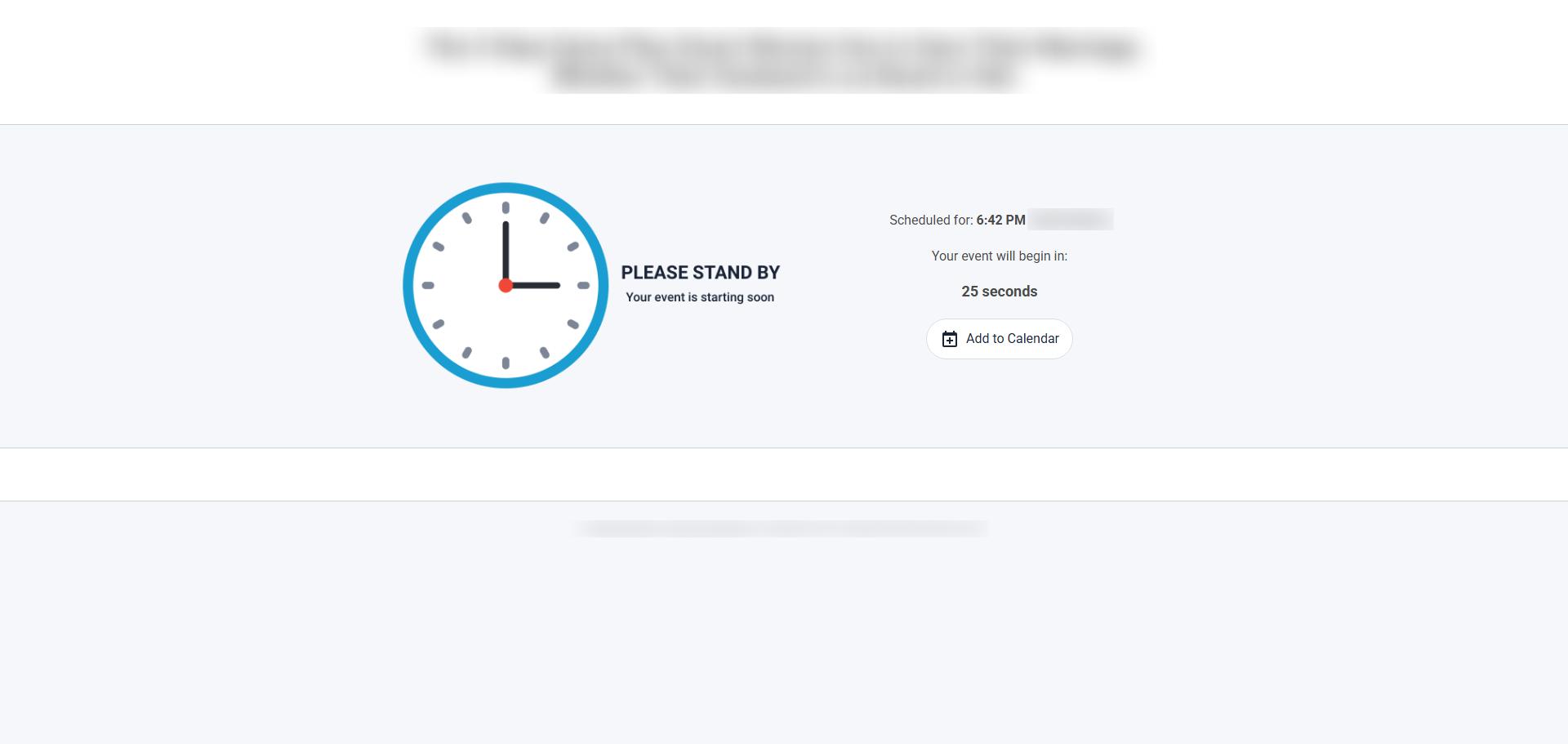
Our client uses StealthSeminar. By default, the waiting room is simple: a title, a subheadline, and a timer counting down from 27 seconds before automatically starting the webinar.
Once the timer hits zero, the webinar begins instantly.
We wondered: Is this step truly optimized? Could we make it better?
Hypothesis
We’d run similar tests for other clients before; including removing the waiting room entirely and, to be blunt, it didn’t work. You might think cutting the waiting period would stop people from dropping off and boost conversions. But in reality, people expect a short pause before a webinar starts. It gives them time to settle in, prepare, or simply feel like they’re attending a real event.
That said, our client wanted to test it anyway. And since we never reject an idea without hard data from that specific business, we agreed.
We also wanted to explore the opposite approach: not auto-redirecting users at all, but letting them click “Join Live Room” when ready.
Test Design
We wanted to measure the impact of timing and control before entering the live room.
Control: The StealthSeminar default waiting room with short countdown and auto-redirect.
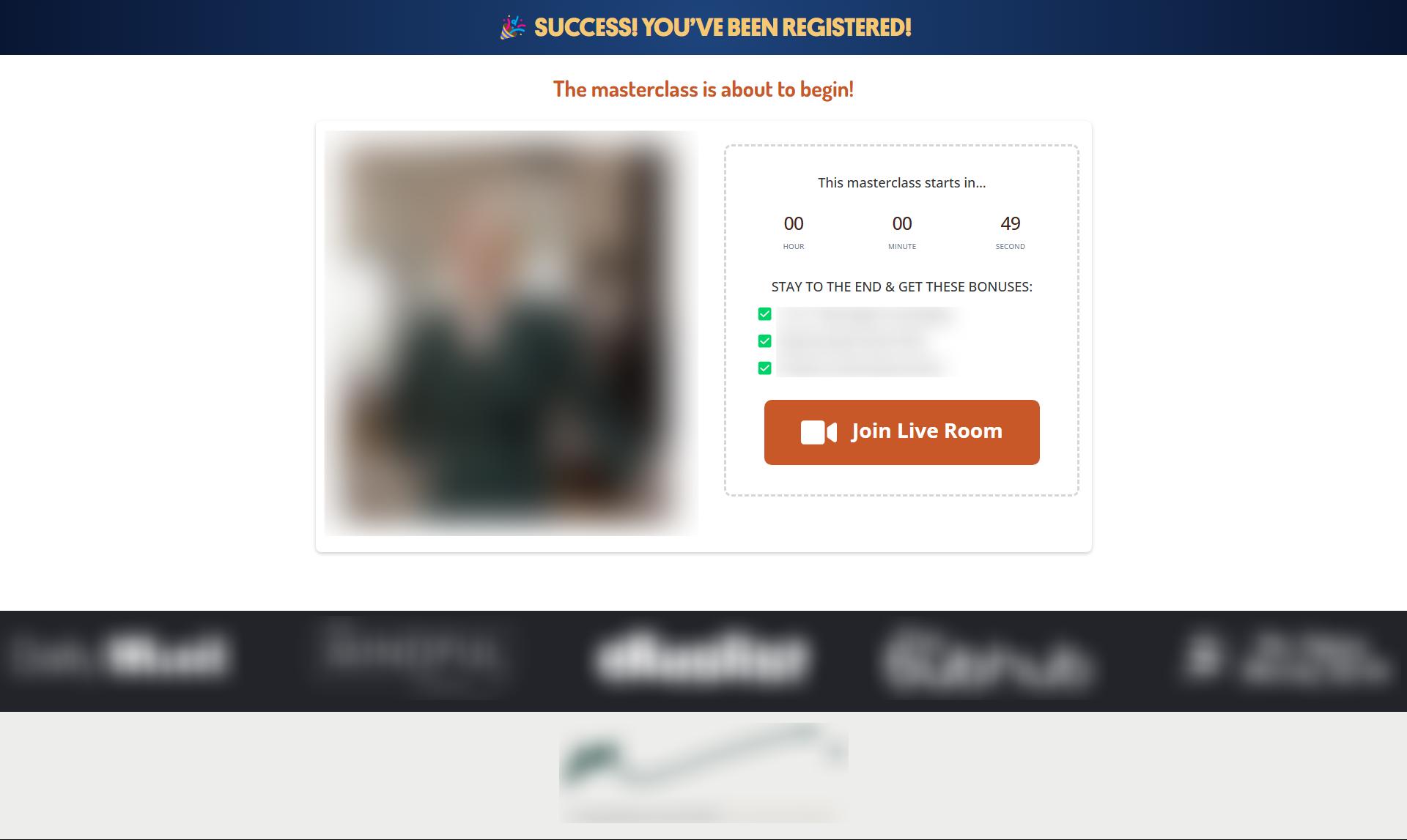
Test group 1 (Manual Join): Keep a waiting room but remove auto-redirect and require a click on “Join Live Room.” Add a one-minute countdown. Our thinking: a controlled pause might build readiness and intent.
Because StealthSeminar’s default page is limited, we rebuilt the waiting room for test group 1:
- Manual “Join Live Room” CTA instead of auto-redirect
- One-minute countdown
- Bonuses section highlighting what viewers get if they stay to the end
- Accolades section near the bottom to increase trust
Test group 2 (No Waiting Room): Remove the waiting room entirely and send users straight into the webinar after opt-in. If “friction is bad,” this should help.
A short delay might increase watch readiness and attention. Zero delay might increase throughput but lower focus. The right balance can lift downstream actions like visiting the application form before the auto-redirect kicks in and, ultimately, enrolling.
Read more about why the waiting room exists in the first place here.
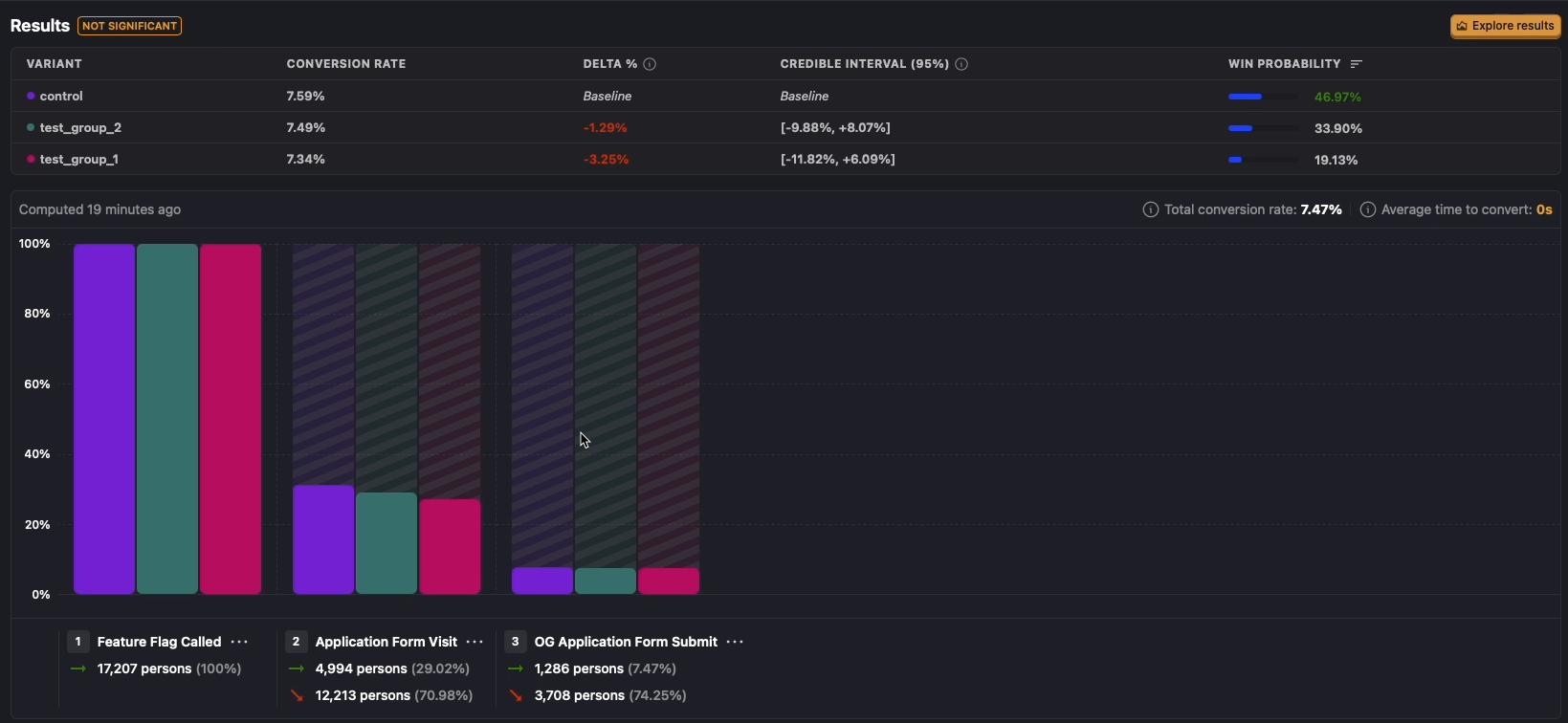
Results
We tracked three levels of outcome:
Primary metric: Application form submission rate.
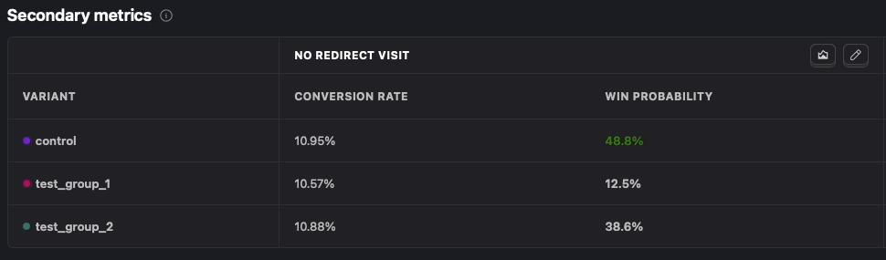
Secondary behavioral metric: Application Form Visit (No-Redirect), This metric captures those who click through to the form before the system auto-redirect.
The webinar automatically redirects viewers to the application form once it has been completed. However, some users choose not to watch the webinar in its entirety. Instead, they click the sign-up button, which appears approximately two minutes before the webinar ends, and proceed directly to the application form. These users are considered high-quality leads for us.
Business outcome: Enrollments (purchases). We reconciled these manually with the client’s internal records to avoid analytics gaps.
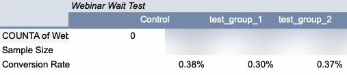
Control edged out both variants on the Form submission, No-Redirect visits metric and on enrollments.
Test group 1 (manual join + looping timer + bonuses + accolades) underperformed on all metrics and did not beat control on enrollments.

Conclusion & Learnings
Control was the frontrunner in almost every metric (not by far though), which led us to call this test a loss.
We weren’t surprised that Test Group 2 (no waiting room) underperformed; our past tests had shown people need that short delay before a webinar.
The real problematic part was Test Group 1. In hindsight, we made a classic CRO mistake: changing too much at once. Instead of just removing the auto-redirect, we also redesigned the entire page, changed the copy, and added extra elements. This meant we couldn’t pinpoint which change hurt performance.
Possible reasons for the drop:
- Removing the auto-redirect hurt conversions.
- The new, more “designed” page backfired (we’ve seen flashy pages reduce conversions before).
- The new copy simply didn’t connect as well.
We cannot determine which of these factors ,or possibly all of them, influenced the outcome, and this uncertainty stems from the test design. The key takeaway, once again, is the importance of changing only one parameter at a time when running an experiment. While testing each element individually may feel slow, it is still far more effective than changing multiple variables at once and being unable to identify what caused the loss or even the win.
If you want to run a test on WordPress, Shopify, or ClickFunnels, Get started with our platform-specific step-by-step guides: [WordPress, Shopify, ClickFunnels].