

This was one of our juicier and more layered experiments. Admittedly, it was a mistake to test multiple hypotheses within a single experiment. we know that best practice is to isolate one variable at a time. However, in this case, the page had enough traffic to reach statistically significant results despite the added complexity.
It was actually the second version of an earlier test, where we first noticed that modifying CTA buttons could potentially improve opt-in rates. After seeing a positive signal in the original experiment, we decided to build on it and take things a step further by testing multiple design and copy changes at once.
Background
While reviewing a client’s opt-in page for a live video event, we noticed a layout with three separate CTA buttons, each allowing users to choose a date. Visually, the section looked functional, but something felt off. The layout was dense, and from a UX perspective, it could be overwhelming, especially for users quickly scanning the page. The separation of buttons and repetition of similar elements created unnecessary friction in the decision-making process.

After some team discussion, we realized that presenting these date options in the form of radio buttons might streamline the experience. Instead of making the user choose between three equal-looking CTAs, a single form with clearly labeled radio buttons could guide their choice more smoothly. This change, paired with a tweak to the top bar message, became the basis for our new A/B test.
Hypothesis
We hypothesized that changing the layout from three CTA buttons to a unified radio button selector would simplify the decision for users and increase opt-in rates. We also suspected that giving users the ability to join a waitlist — in case none of the listed dates worked for them — would help capture otherwise lost leads. Lastly, we believed that changing the top bar text from a list of dates to a clear directive might further reduce friction and boost conversions.
Test Design
We tested three different versions of the opt-in page.
The control version kept everything as-is: the three CTA buttons and the original top bar displaying the dates (“Sunday, Feb. 23rd | Tuesday, Feb. 25th | Wednesday, Feb. 26th”).
Test Group 1 (TG1) replaced the three CTAs with a single radio button selector listing the same three dates. The rest of the page stayed unchanged.

In Test Group 2 (TG2), we kept the radio button setup from TG1 and added a fourth option:
“I Can’t Make It Live – Put Me On The Waitlist!”
This gave users a chance to opt in even if they couldn’t attend any live session.

Test Group 3 (TG3) included all changes from TG2 but added one more improvement: we replaced the top bar text with a clearer message;
“Pick The Date You Want To Attend Below!”
This aimed to make the page more intuitive and remove any ambiguity.

To learn how to set up an experiment in PostHog, read this.
Results
The test ran for six days and included 34,946 users.
|
Conversion Rate |
Delta |
Win probability |
|
|
Control |
49.12% |
Baseline |
5.47% |
|
Test Group 1 |
49.47% |
+0.73% |
67.69% |
|
Test Group 2 |
49.22% |
+0.20% |
54.84% |
|
Test Group 3 |
50.14% |
+2.08% |
90.81% |
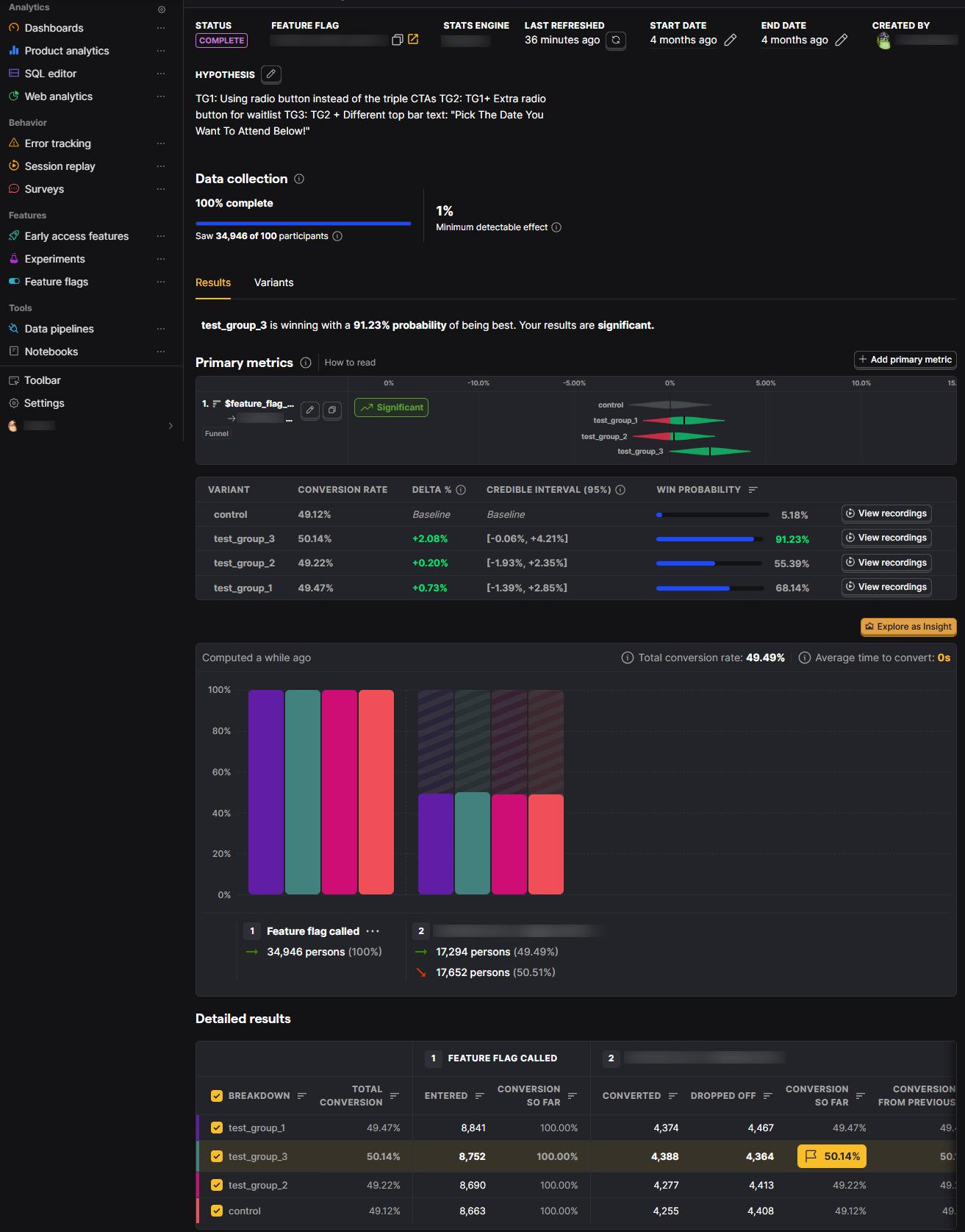
In TG1, switching to radio buttons resulted in a 0.73% improvement in opt-in rate over the control. While not a dramatic lift, it confirmed that simplifying the selection method made a slight difference in usability and user flow.
TG2 didn’t produce any further improvement in overall opt-ins, despite 1,200 users choosing the waitlist option. This suggested that those users might have previously clicked a random date just to move forward, without true intent to attend. So even though the total conversion didn’t increase, the quality of the leads likely improved by offering a more honest option.
TG3 showed the biggest impact, with a 2% increase in opt-in rate compared to the control. This variation’s success highlighted how effective a simple content change can be. By clarifying the purpose of the section (“Pick The Date You Want To Attend Below!”), we guided users more directly to take action, and it paid off.

Conclusion
This test is a perfect example of how optimization is often a chain of small, smart decisions, not a single dramatic shift. It shows how a “winning” test can serve as a launchpad for even more impactful experiments.
Due to an error in how we originally defined the test, we now need to compare the test groups one by one. It’s important to ensure that each comparison is made between two groups that differ by only one element.
Comparing the control version with Test Group 1, we saw a boost in conversion, highlighting that presentation matters. Even subtle changes, like switching from buttons to radio inputs, can improve the user experience.
When we compared Test Group 1 with Test Group 2, conversion rates dropped. This suggests that adding an option like a waitlist doesn’t always improve the primary metric, though it can still provide value by capturing warmer leads and enhancing user satisfaction.
Finally, comparing Test Group 2 with Test Group 3 revealed a significant increase in opt-ins. This shows the power of content clarity; language placed at the top of the page can meaningfully influence user behavior.
What started as a simple UX adjustment became a layered and insightful test and a great example of how to keep improving, even when you’re already seeing good results.
We’ve created step-by-step guides for setting up PostHog on different platforms.
Click on your platform to get started. [WordPress, Shopify, ClickFunnels]